
Why Your Painting Feels Busy (and How to Fix It)
You finish a painting and something feels off.
Nothing is obviously wrong, but nothing feels clear either.
Here’s why might be happening: Viewers do not know where to look.
Their eyes keep bouncing around the surface. Everything feels loud, even if the drawing and color are solid.
This is one of the most common problems painters run into, and it often gets mislabeled as a color problem or a detail problem.
In reality, most busy paintings suffer from the same underlying issue.
They treat everything as equally important.
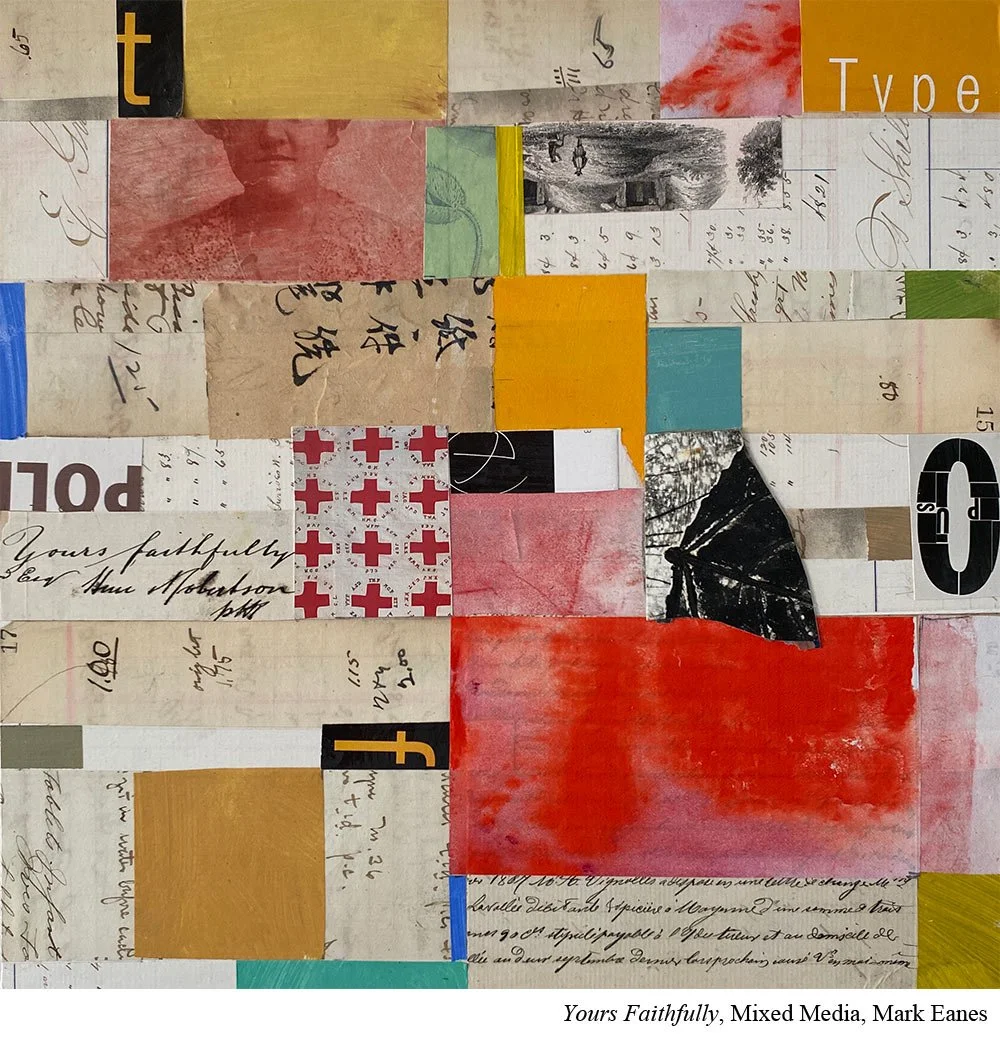
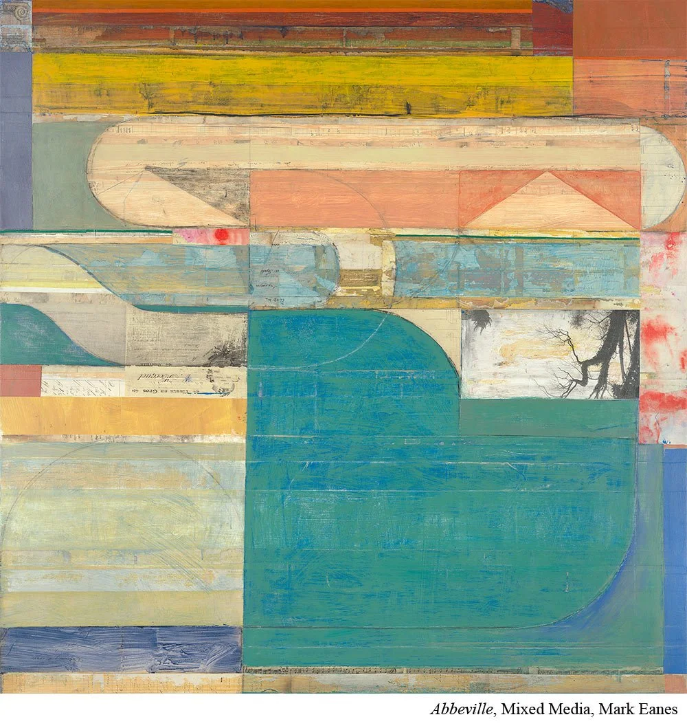
According to Mark Eanes (Ep.28), the fix is learning how to rank what matters.

The Real Reason Paintings Feel Busy
There are a lot of moving pieces in a painting, but not all of them can be equally important from a visual standpoint.
In every strong painting, one area needs to lead. Other areas need to support it. And some areas need to stay quiet.
When that ranking is missing, the painting feels busy.
This ranking is called hierarchy. It is simply the ordering of what is most important and what is less important in your painting.
Your focal area carries the highest priority.
Secondary areas support it.
The edges of the painting carry the least.
When contrast, detail, and sharpness are spread evenly across the surface, the viewer’s eye has no clear place to land. The painting may be technically competent, but it feels flat, exhausting, or confusing to look at.
Hierarchy gives the viewer guidance. It tells them where to look first and where they can move on more quickly.
And this is not something you add at the end. It affects how the painting needs to be built from the very beginning.
How Painters Accidentally Create Busy Paintings
Most busy paintings are not the result of bad decisions. They come from very understandable habits.
One common mistake is trying to make everything interesting. When every area has strong contrast, sharp edges, and high detail, nothing stands out. The viewer’s eye has no place to rest.
Another issue is placing high contrast near the edges of the painting. Bright highlights, dark accents, or crisp shapes at the border pull attention away from the focal area and can even lead the viewer out of the painting entirely.
Many painters also confuse detail with importance. Adding more detail does not automatically make an area more meaningful. In fact, heavy detail in secondary areas often competes directly with the focal point.
Finally, hierarchy often breaks down when it is not planned ahead of time. Without clear priorities established early, contrast and detail tend to spread evenly as the painting develops.
How to Fix a Busy Painting
Hierarchy is the plan, but you create those levels of importance through contrast.
Color contrast, value contrast, shape contrast, edge contrast, and detail all influence how a viewer reads a painting.
High contrast pulls the eye.
Low contrast lets the eye move on.
This means your most important areas should have stronger contrast, while less important areas should have weaker contrast.
That is why you will often hear this advice for handling a focal area:
Place your lightest light next to your darkest dark at the focal point.
Make that the only place in the painting where that extreme contrast occurs.
When you do this, the viewer does not have to search. Their eye is naturally drawn to the most important part of the painting.
Value is not the only tool you can use. You can also simplify shapes, soften edges, or reduce detail in secondary areas. Fewer sharp edges and less information quietly signal, “This matters less,” allowing the focal area to do the heavy lifting.
Hierarchy is not about making one area good and the rest bad. It is about making intentional choices so the viewer knows where to look and where they do not need to linger.
When hierarchy is clear, the painting feels calmer, more confident, and much easier to read.
Put It to Practice
If your painting feels busy, the fix is not adding more. It is deciding what matters most.
Before you begin your next painting, establish a hierarchy on purpose.
Start by asking one simple question:
If viewers could only see one thing, what would you want that to be?
Next, decide what is least important.
Then identify a few areas that fall somewhere in between.
Move this thinking out of your head and onto paper by using thumbnail studies. These do not need to be detailed or polished. A few minutes of simple shapes is enough to explore visual priorities.
Then decide which types of contrast you will use to support your plan. Write them down. It is easy to forget your intentions once you are mid painting.
At the end of the painting, do a quick hierarchy check.
Did you follow your plan?
If not, why?
If yes, how did it work or not work?
Use those answers to guide the next painting you try.
A painting feels busy when it has no clear priority.
Clear hierarchy removes that problem at the source.
Get practical advice from today’s best painters sent straight to your inbox by signing up for the newsletter below.