
How to Organize Your Palette Beyond Hue
When it comes to color, many artists gravitate toward the limited palette. That usually means a warm and a cool version of each primary color: red, yellow, and blue.
When they arrange their colors, they often let hue relationships guide them, laying everything out like a color wheel.
But it’s not the only way to do it.
Dreama Tolle Perry (Ep.18) takes a different approach, and it supports two things she cares about deeply: vibrant color and a repeatable process that helps her paint with confidence.
Transparency First
Perry uses an expanded palette of 14 colors plus white. She originally standardized that palette through teaching, so students could replicate what she was doing. Over time, she found that the same consistency served her, too. With a fixed set of colors, she can mix almost anything she needs without guessing.
But here’s where things get interesting.
Instead of organizing her palette as one big color wheel, she divides her pigments by transparency.
Her more opaque colors, including cadmiums, live together in one area.
Her transparent colors live together in another.
Then she takes the second step that makes the whole system work: she places her colors in the same order every single time.
Fourteen pigments are a lot of pigments. And some, especially the transparents, look much darker straight out of the tube than they will once adjusted. That’s a lot of variables to manage.
This could make color mixing really confusing. Especially if you’re having to hunt for colors to begin with.
Image if the keys on a piano changed every time when you sat down to play. That would be chaos.
It’s the same with your palette.
In order to lower potential confusion, Perry has specific homes for each pigment. This way she doesn’t ever have to search for a color. She already knows exactly where it is.
Palette Set Up for Mixing and Vibrancy
To get great color, it helps to be strategic, and Perry is absolutely strategic about color.
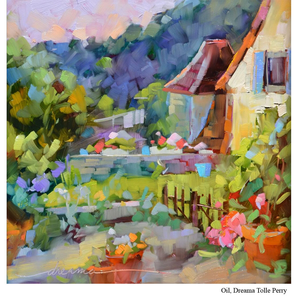
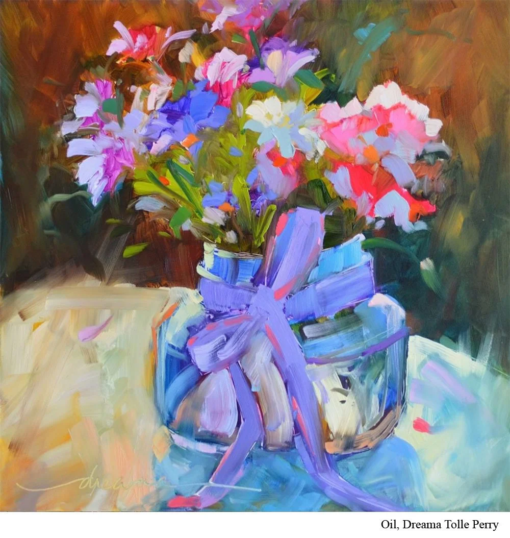
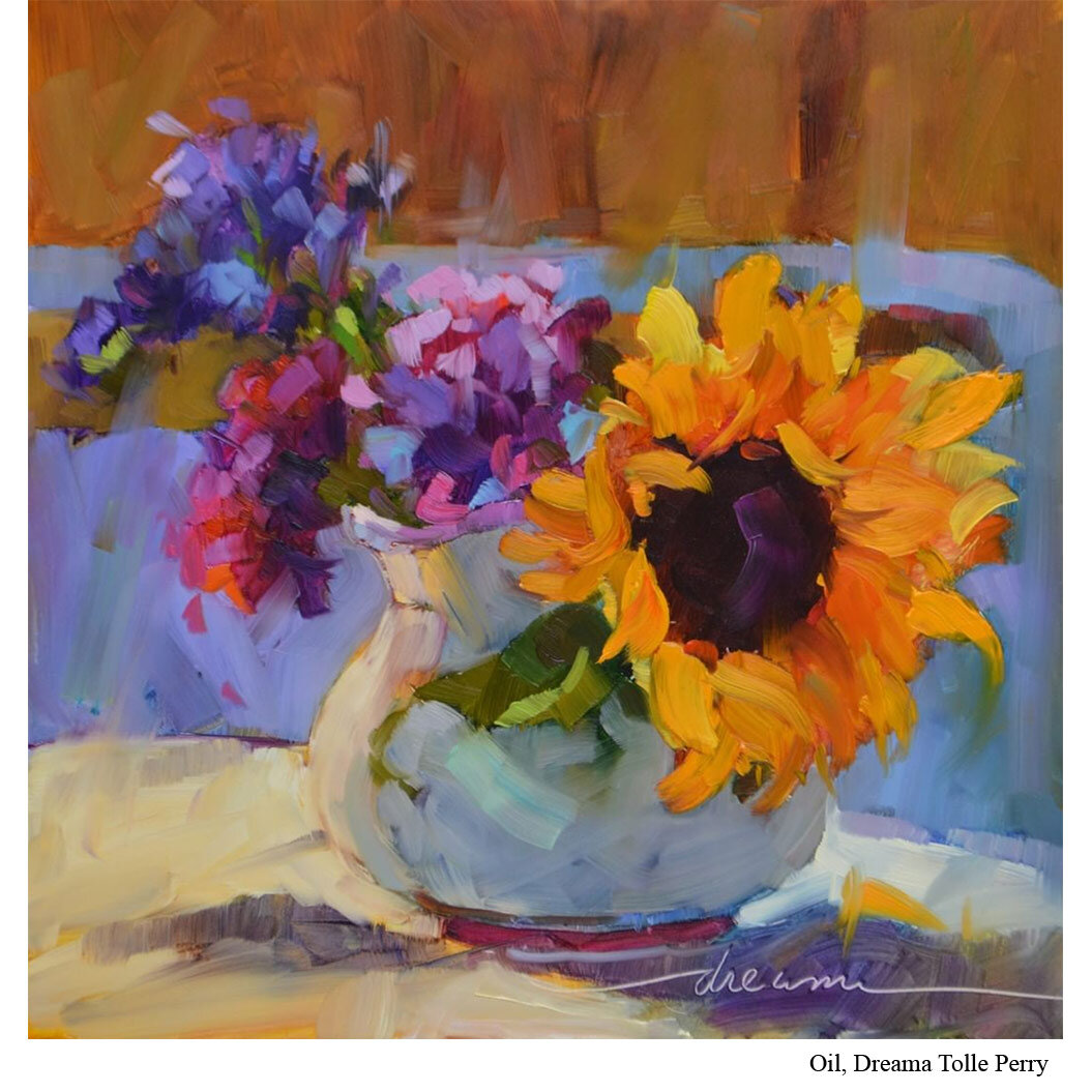
She often begins with a transparent first layer that covers the entire surface. She uses a smooth panel, and those transparent pigments allow light to bounce through in a way she compares to stained glass.
Then, as she continues the painting, she brings in the full palette, including white.
This is where mixing comes in.
Many transparent pigments are naturally darker, so to bring the value up, you mix in white (or an opaque color). When you tint a transparent color with white, it can “blossom” into bright, clean passages.
Perry does both of these things in the second layer. As part of this process, she makes sure to leave bits of the original transparent layer peeking through. The combination of a transparent underlayer and more opaque strokes on top creates a special kind of vibrancy.
Her transparent pigments have jobs. Her opaque pigments have jobs. And when she’s ready for a specific job, she wants to be able to reach for the right colors, in one area, without hesitation.
By organizing the palette by transparency and then by hue, she stays confident that she has the right pigment for the task at hand.
Put It to Practice
If you want to borrow Perry’s approach without changing your entire palette, try this:
Group your paints by transparency.
Look at your tubes and sort them into three loose categories: opaque, transparent, and in-between.
Place them the same way every time.
Choose an order and stick with it. The goal is to reduce hesitation mid-painting. At first, this will feel awkward. Give it about a month of active use to see if it’s a good fit.
Mix in the shortest distance possible.
Perry’s rule of thumb is that once you start mixing more than two or three colors, your mixture often starts to trail off into dullness. Try to arrive at your target color with the fewest pigments possible.
Reset your mixing area before it turns into a mud festival.
If your palette is crowded with piles of half-used mixtures, scrape a section clean and start fresh. Clean space helps clean color.
Try the opposite of your default.
If you tend to paint mostly with transparent pigments, try intentionally using a few opaque mixes. If you tend to rely on opaques, try building a small passage with transparent color first, then tinting with white later. Notice what changes.
You may find that separating your colors by transparency, and keeping them in consistent positions, helps you make clearer decisions while you paint. Not just about what color you want, but about what kind of paint behavior you want, too.