How to Use Color More Intentionally in Your Paintings
Sometimes it seems like color is the life of the painting party. But don’t be fooled by its bright personality. Color walks in the door knowing it has some very important jobs to do.
And whether you paint non-objectively or with a high level of realism, your color affects your viewer.
Artist Wayne Jiang (Ep.114) felt this truth when working on a commission of a family portrait. He tried several different color combinations, and they all felt totally different.
So whether or not you understand what your color is doing and use it intentionally, it’s still having an impact.
Another way to think about it is music. If you don’t know how notes work together, you might hit random keys. Sometimes you’ll get combinations that are pleasing. Other times you won’t. Sometimes you’ll get combinations that evoke certain moods. Other times you’ll create a completely different effect.
Color is the same way.
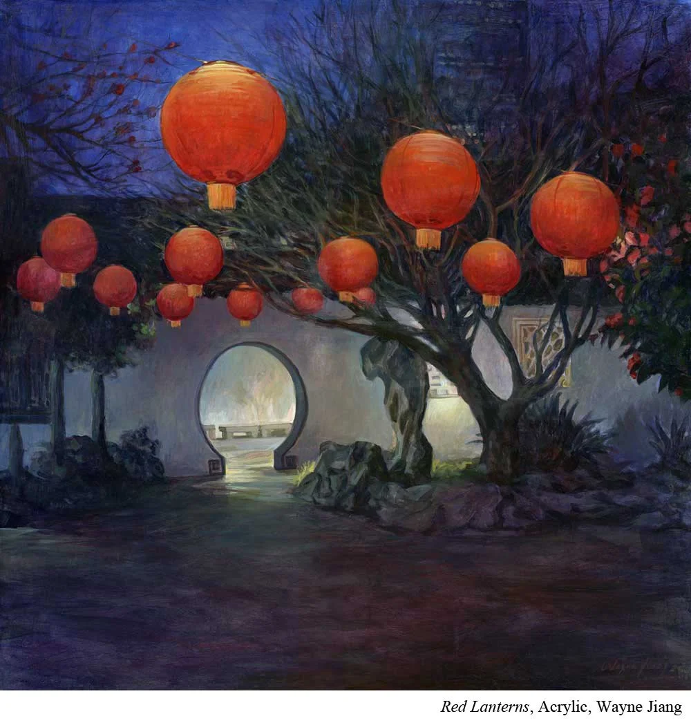
Colors can evoke emotion. When placed next to other colors, those relationships can create visual effects. Color can say, look here, not there. It can help tell you the time of day or even the time of year.
So as you work toward using color more intentionally, let’s look at some of the jobs color might take on in your painting.
Color Can Tell a Story
Maybe color’s best-known job is helping tell the story of a painting.
Part of that story is emotional.
This is where Jiang realized he needed to make a decision.
One set of colors conveyed a sense of springtime. Another felt more like autumn.
And that changed the story of the portrait. Jiang was painting grandparents with their grandchildren, and he wanted the painting to convey hope and excitement. So the spring colors won out.
The colors you choose matter, but so do the relationships between those colors.
A painting built primarily with analogous colors, colors that sit near one another on the color wheel, will often feel calmer because the colors are more similar. Complementary colors from opposite sides of the wheel create more contrast, which can make a painting feel more energetic.
Of course, this isn’t a rule. You can make an analogous painting incredibly energetic, and you can create a somber painting filled with complements.
But mood is only part of the story color can tell.
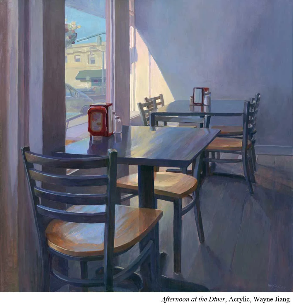
Color can also give us clues about when a scene is taking place.
Different times of day have different colors of light. Sunrise or late afternoon light might be warmer, while midday light can feel cooler or bluer.
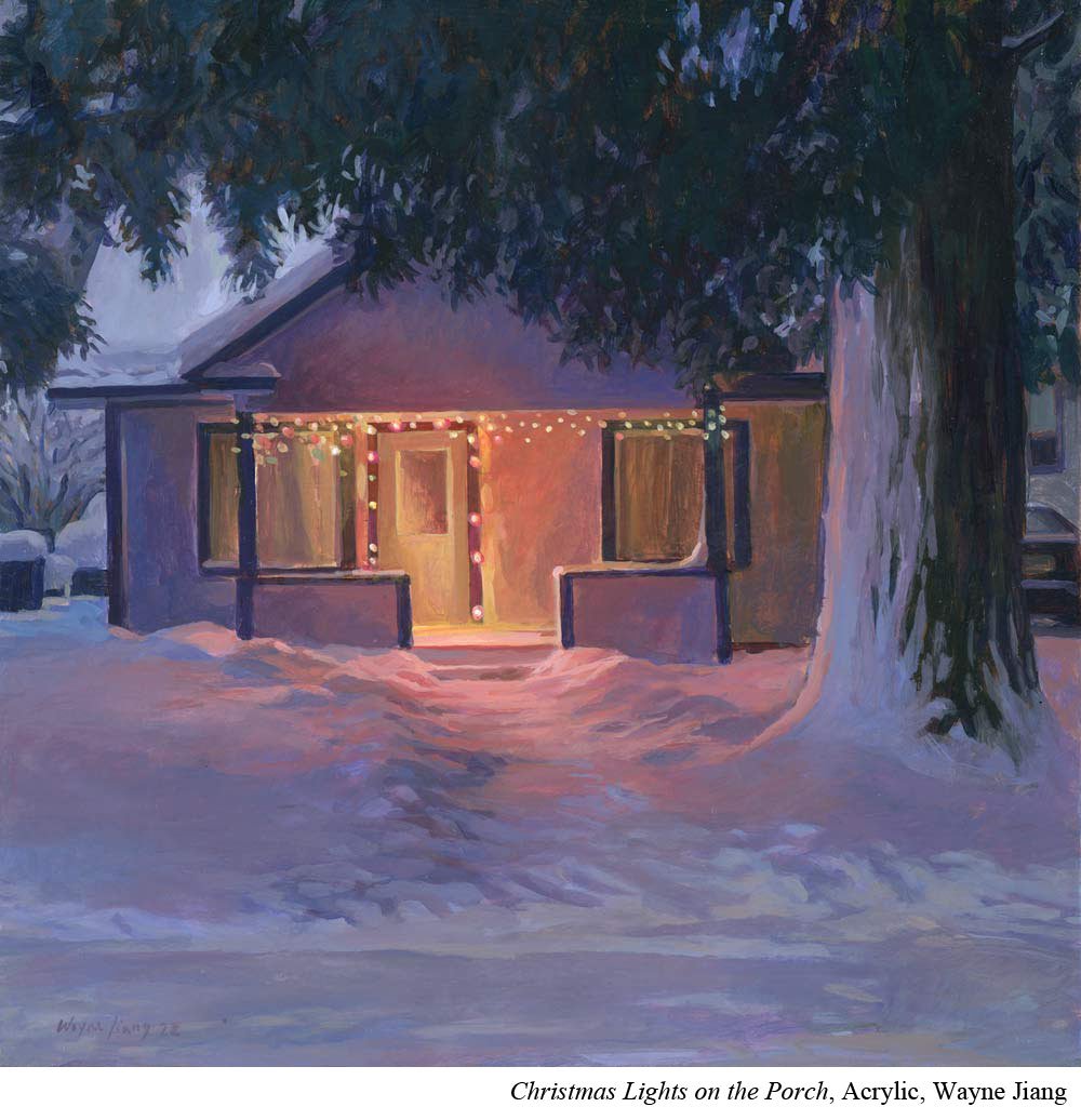
The seasons can change the colors we see too. Spring might bring highly saturated greens and flowers, while winter may have a much more muted palette.
All of these color decisions help establish the world of the painting. They can tell us something about how the scene feels, what the light is doing, and even what time of day or year we might be looking at.
Color can tell us about the story of the scene. But it also has more structural jobs to do.
Color Can Create Form
Color helps give objects form, and it can do that in several ways.
First, every color has value. Value is simply how light or dark that color is.
If you’re trying to convey a blue ball sitting in direct sunlight, the sunlit side of the ball will probably be lighter than the shadow side.
But value isn’t the only characteristic helping create that sense of form.
Temperature can play a role too.
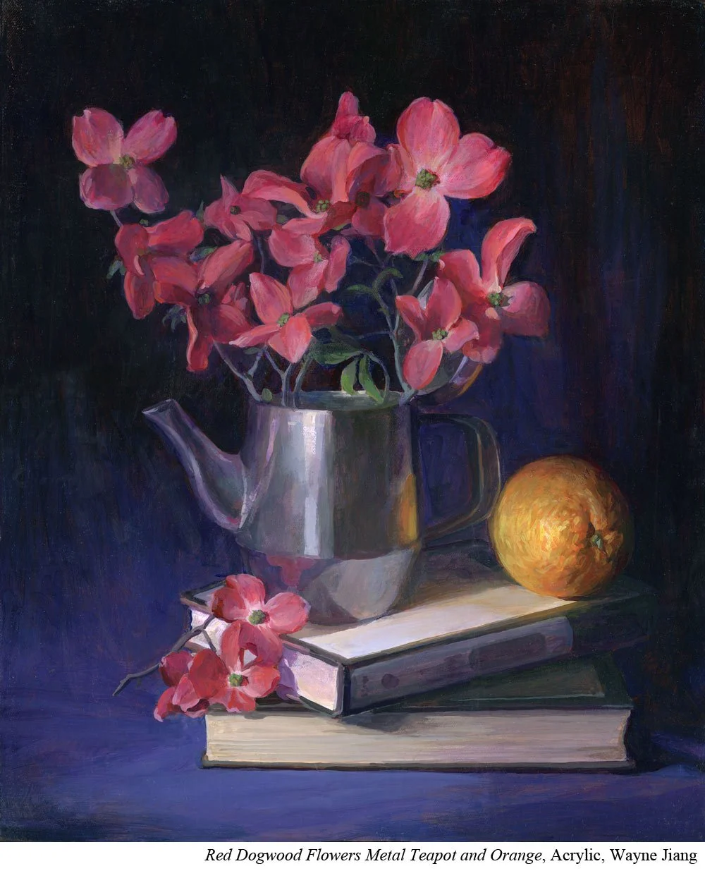
For this, you’ll want to think about the color of your light. For example, the side facing a warm light source might be warmer than the shadow side that isn’t receiving that same light.
Form comes through relationships. A warm blue alone doesn’t necessarily convey form. But put that warm blue next to a cooler blue and the temperature change can help suggest the turn of the object.
Portrait artists who are interested in capturing the color of light often pay close attention to this. A cheek may still be mixed from the same general group of skin-tone pigments, but a very small shift warmer or cooler can help show the form turning.
Color can help describe how a form turns in space. It can also help describe where that form sits in the larger space of the painting.
Color Can Create a Sense of Depth
Color can affect your viewer’s sense of atmospheric perspective.
Once again, this is about relationships.
A color on its own doesn’t necessarily convey where it sits in pictorial space. But when you place it next to another color, a story can begin to unfold.
Let’s say you have a landscape filled with greens.
Generally speaking, darker greens can feel closer than lighter greens.
More saturated greens can feel closer than less saturated greens.
Warmer greens can feel closer than cooler greens.
You don’t have to use all three shifts at once. But changes in value, saturation, and temperature can all help you suggest that one area is closer and another is farther away.
All of these relationships can also affect where your viewer looks. A dark green against a field of lighter greens doesn’t just appear closer. The contrast can also attract attention.
And that gives color another job: helping you direct the viewer’s eye.
Color Can Move the Eye
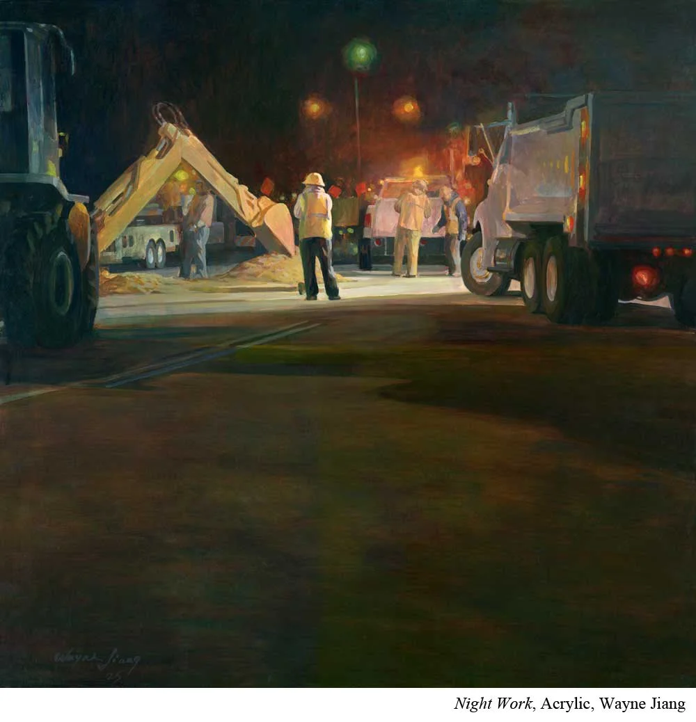
High contrast tends to attract attention.
Often, value does a lot of the heavy lifting here.
If you place your darkest dark next to your lightest light, and that’s the only place in the painting where those two values sit beside each other, there’s a good chance your viewer will look there first.
But contrast doesn’t have to come only from value.
It can also come from hue or saturation.
Go back to that green landscape.
Let’s say you place a single red flower in the middle of the field. That red is going to attract attention because it’s very different from everything around it.
Now change the scenario.
Instead of one red flower, you add a whole band of red flowers.
Suddenly there’s much less contrast between any one flower and the others.
So you could bring saturation into the equation.
Maybe most of the flowers are mixed as grayed-down reds. Then you add one fully saturated red.
That shift from lower saturation to higher saturation can pull the viewer’s eye toward that flower.
Color Can Be Something You Simply Enjoy
We’ve talked a lot about the technical jobs of color.
But color has another job too.
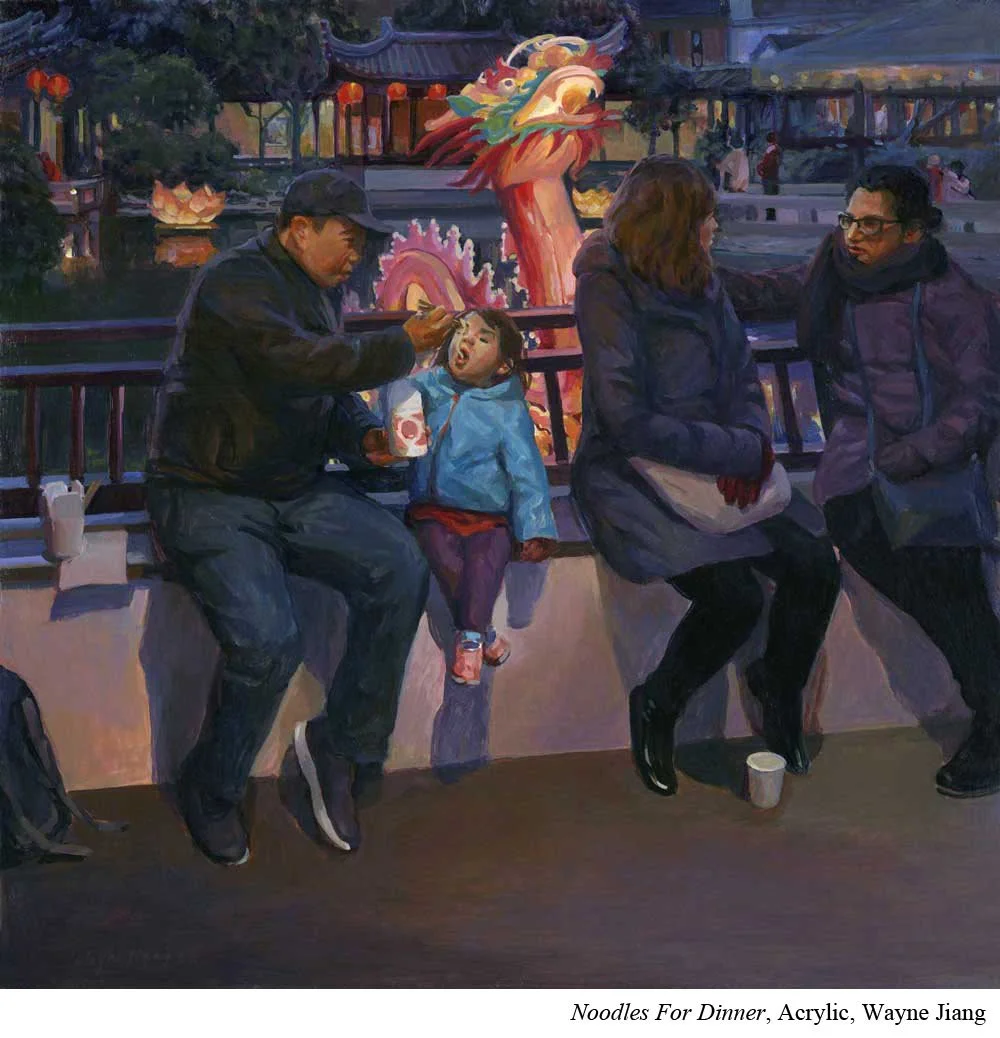
You get to enjoy it.
There’s no equation for this one.
You discover it by creating a lot of work and noticing what kinds of color make your heart sing.
What combinations do you love?
What pigments do you enjoy working with?
And just because you love the colors another painter uses doesn’t necessarily mean you’ll enjoy working with those same colors yourself.
Color preference is an incredibly personal part of building your artistic skills, and it’s just as worth paying attention to as the more technical jobs of color.
After all, you’re the artist.
You want to like the colors you use.
Put It to Practice
The next time you finish a body of work, look through it and ask yourself two questions:
What jobs am I asking my colors to do?
How well are they doing those jobs?
This isn’t about deciding whether a painting is good or bad. That’s judgment. We’re interested in information.
Maybe your color is doing a great job creating mood, but the painting feels pretty flat from a form or perspective standpoint.
Maybe your colors describe form beautifully, but the mood isn’t especially clear.
Maybe the color combinations themselves are working well, but the area you intended to be the focal point… isn’t.
Take the jobs above and assess them one at a time.
But as you do, remember that a color will often be doing more than one job at once. The same shift in value, temperature, hue, or saturation might help create form, establish depth, AND move your eye through the painting.
This is part of what makes color one of the most nuanced and complicated groups of skills you’ll build as a painter.
So if you start to feel your inner critic puffing up, take a break.
And remind yourself: We aren’t born with all these skills. We build them one foundation at a time.