A Gallon, a Pint, and a Cup: A Simple Way to Think About Color
You choose a handful of colors you love and you get mixing.
Maybe it’s a beautiful phthalo mixed with white to make a turquoise. Maybe it’s your favorite bright pink. A bright, cheery yellow.
A little of this and a little of that.
You start with one color, jump to the next, and then the next. When you step back… but something feels off.
Nothing is necessarily wrong with the colors themselves. They are lovely.
So where should you solve the problem?
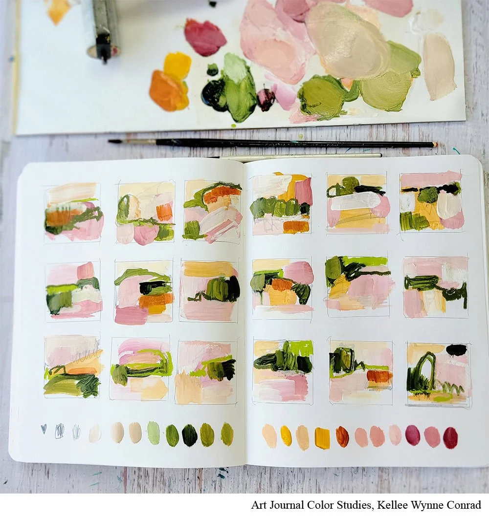
One place to look: Make sure all the colors aren’t getting equal billing.
When it comes to color, it’s not just about which colors you use. It’s also about how much of each color you use.
Mixed media artist Kellee Wynn Conrad sees this again and again in her students. They put lots of colors on their palettes and then use them in roughly equal amounts. In the end, the painting doesn’t work as well as it could have.
Her solution is to create a hierarchy.
She uses an especially memorable way of thinking about it:
A gallon. A pint. A cup.
One color gets a lot of space.
Another gets considerably less.
And another appears only in small amounts.
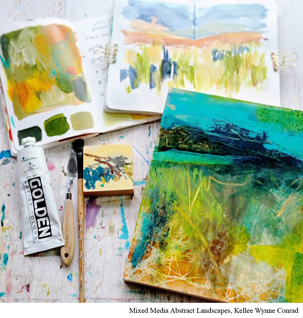
The Gallon: Your Dominant Color
This is the color family that occupies the most visual space.
It establishes much of the painting’s overall color character.
Importantly, “gallon” doesn’t necessarily mean one exact mixture repeated everywhere. You could have several yellows, yellow-oranges, ochres, and other related colors that collectively create a dominant warm-yellow family.
The Pint: Your Supporting Color
There’s enough of this color for it to play an obvious role, but it doesn’t compete equally with the dominant color.
It might create contrast with the gallon or help move the eye around the painting.

The Cup: Your Accent
This is the color you use sparingly.
Because there’s less of it, a small amount can become surprisingly noticeable.
And this is the fun thing about contrast. Sometimes less is more. When you have just one spot of a color, suddenly it pulls your viewer’s eye.
That’s what can make accent colors so useful at a focal point or secondary area of interest.
Just be careful. If you add too much of the accent color, it stops being an accent. Now you’re headed back toward equal parts.

Changing the Proportions Changes the Painting
You can dramatically change how a painting feels by changing the proportion of colors, even if you’re using the exact same palette.
Think about the primaries of red, yellow, and blue.
A painting that is predominantly blue, with blue as the gallon, is going to feel different from a painting that is predominantly yellow. You get to decide which color plays the largest role simply by changing how much of each color you use.
The palette hasn’t changed.
But the paintings can feel dramatically different because you changed the hierarchy.
You could take this even further.
Make blue the gallon, yellow the pint, and red the cup.
Then make yellow the gallon, red the pint, and blue the cup.
Then make red the gallon, blue the pint, and yellow the cup.
You’ve used the same three colors every time, but you’ve changed how much work each color is doing within the painting.

It’s Not Just About Quantity
So far, we’ve been talking primarily about hue and how much space each hue occupies.
But color has many characteristics, and those characteristics can also affect how your gallon, pint, and cup interact.
For example, your cup color could also be:
More saturated than the dominant color.
Lighter or darker than the colors around it.
Complementary to the dominant color.
Concentrated near your focal area.
Color properties work together.
The amount of blue matters. Its value matters. Its saturation matters. Where you put it matters.
If that feels like a lot to think about, you don’t have to try adjusting everything at once.
Start by noticing where you’re using colors in roughly equal amounts. Then experiment with shifting those proportions toward a gallon, pint, and cup approach.
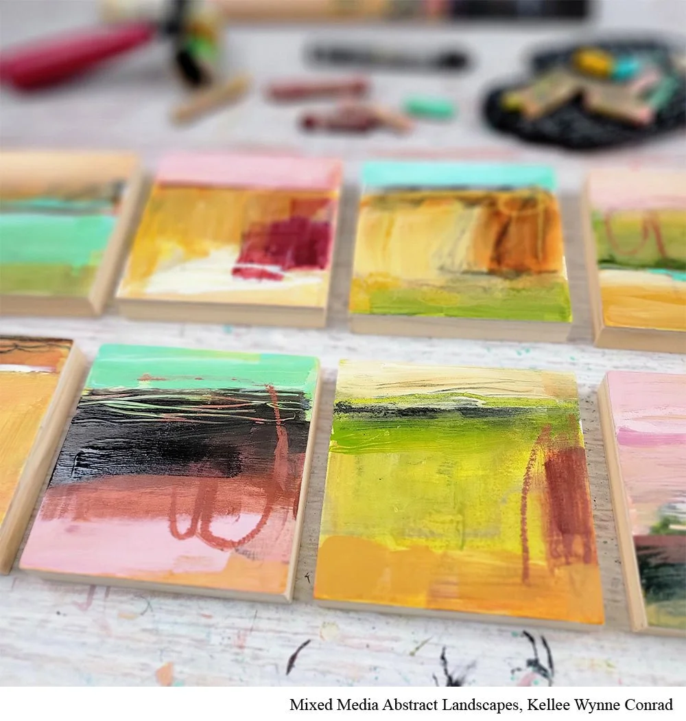
Put It to Practice
Choose three colors.
Make three small studies using the same three colors.
For your first study, assign:
One color the gallon role, giving it the most space.
One color the pint role, using it in a smaller amount.
One color the cup role, using it only as an accent.
For your next two studies, change the roles.
The color that was your gallon might become your pint and then your cup. By the end, each color should have had a chance to play the dominant role.
You can work abstractly with shapes, or you can work from the same reference photo for all three studies.
This isn’t about making finished, beautiful paintings. It’s about noticing what happens when you change your color hierarchy.

Once you’re finished, compare your studies.
Which color did your eye notice first?
Did the cup color feel less important because there was less of it, or did its scarcity make it more noticeable?
How did changing the dominant color change the overall feeling of the painting?
So the next time the color in your painting isn’t working, the problem might not be the colors themselves. It might be how evenly you’ve split them across your piece.
Sometimes you need to change how much you’re asking each color to do.
Instead of giving every color equal space, decide which one is dominant, which one is supporting it, and which one is showing up just enough to get noticed.
Then the next time you put three colors on your palette, you can ask:
Which one gets the gallon? Which gets the pint? And which one only needs a cup?