
Why Two Tubes of Blue Never Act the Same
You stand in front of the paint rack, staring at what feels like ten versions of the same blue.
Cerulean. Cobalt. Ultramarine. Phthalo.
Different names. Different prices. Same color… right?
Yes, and no.
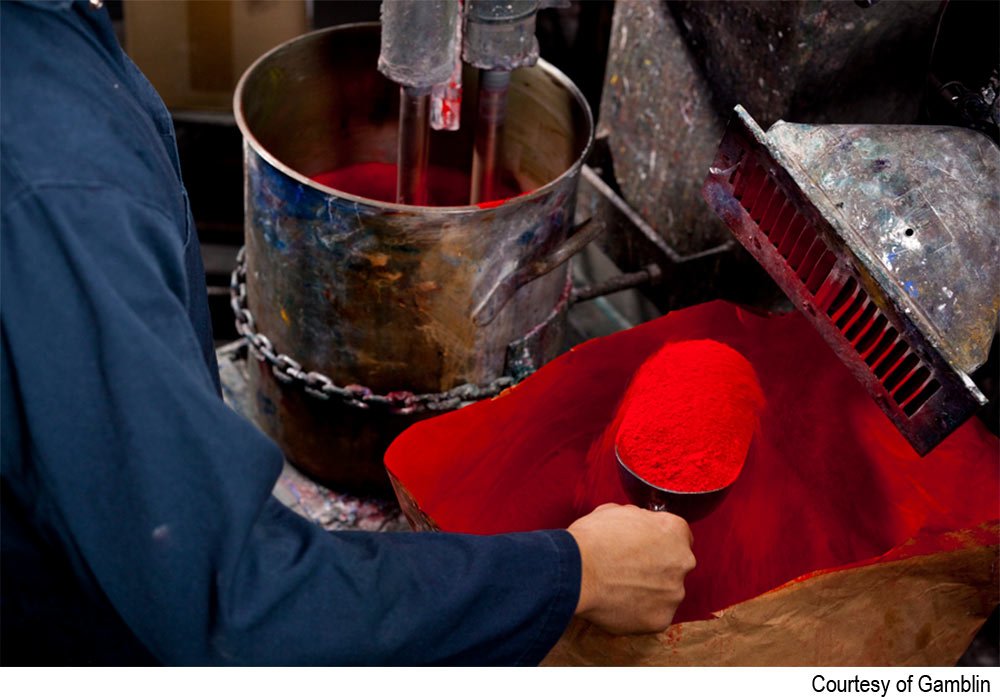
When you squeeze paint from a tube, Mary Wiesenberger from Gamblin (Ep.43) says you are squeezing out two primary components: pigment and binder.

At a basic level, pigment refers to the particles of color. The binder keeps those pigment particles from floating away and helps them stick to and stay on a surface.
The pigments themselves are more or less the same from medium to medium. Watercolor, acrylic, and oil paint all use, for example, cobalt blue to create cobalt blue paint.
The primary difference between media is the binder. Watercolor uses gum arabic as its binder. Acrylic uses polymer. Oil paint uses oil.
Here’s why that matters.
When you understand the components of paint, you can start to understand why certain things happen the way they do.
Not all those blues at the art store will behave the same. That’s because pigments have unique qualities. Some are more transparent, while others are more opaque. Some have higher tinting strength, others less. Some lean warm or cool. Some are lighter or darker. More or less saturated. In watercolor, some pigments granulate or stain.
All those fancy art store names, quinacridone, cobalt, burnt sienna, refer to the specific pigments inside the tube. Those pigments have different characteristics and will behave differently from one another.
Understanding pigments and binders, even at a surface level, also helps explain the difference between student-grade and professional-grade paints.
Professional-grade paints are more expensive because they contain more pigment and less binder. Student-grade paints contain less pigment and more binder, which helps keep costs down. That extra binder is also why you sometimes need multiple layers to fully cover what’s underneath.
Put It to Practice
The next time you paint, shift your attention from what the color is called to how it behaves.
If that feels like too much, start with one thing: opacity.
Notice which colors allow underlayers to show through and which ones block what’s underneath.
As you work, name what you see. Transparent. Opaque. Strong tinting. Saturated. Muted. Warm. Cool.

This kind of noticing works especially well when you are swatching, since you can slow down and observe how individual pigments behave on their own and next to others. (It is one of the reasons we spend time on structured swatching inside the Art Habit Membership, not to make prettier charts, but to build real familiarity with materials.)
So the next time a color surprises you, pause before assuming you did something wrong. Check the label. Notice the pigment name. Notice how transparent or opaque it is. Think about how that pigment might work differently than another similar hue.
You are not just learning to paint. You are learning how your materials work, and that knowledge compounds every time you show up in the studio.