
Why Some Paintings Hold Together and Others Don’t
Sometimes painting feels like juggling.
There’s the drawing part. The brushstrokes part. The value part. The composition part.
And even when you feel like you have them all up in the air, working on their own, sometimes they don’t feel like they work together. Everything falls.
Artist Julia Katz (Ep.110)) knows this struggle well. It’s why she has one guiding principle she never loses sight of. Everything in the painting must belong.
Here’s how you can use her ideas to make your next painting stronger.
The Metaphorical Level
While there are technical parts to this principle, it doesn’t start there. It starts with how you think about the world inside your painting.
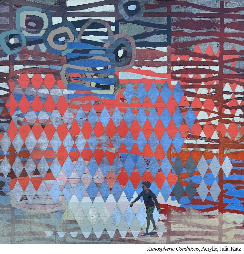
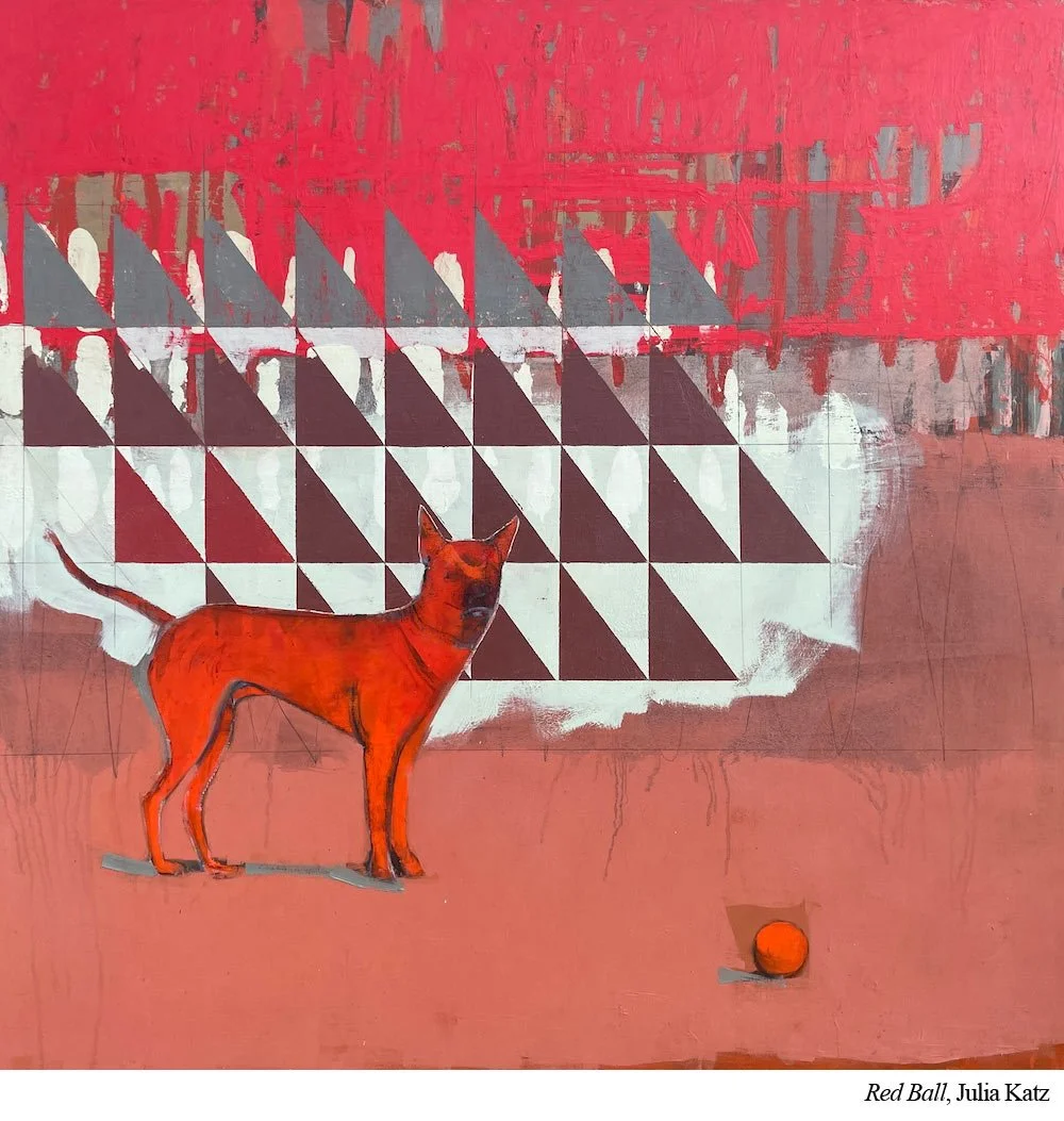
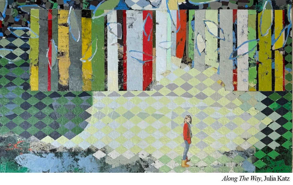
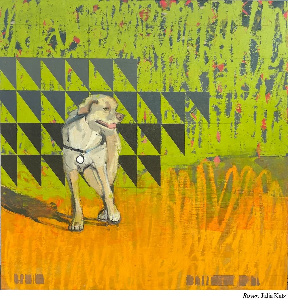
Katz’s figures aren’t just subjects. They are part of a world she is creating on her canvas.
Whether her setting is a literal beach or a more abstract field of patterned color, she wants her subjects to feel like they are living inside it. Are part of it.
One way to do this is to build a story.
If you are painting a landscape with a barn, what is the weather like that day? What would it feel like to walk through that field?
If you are working on a still life, what kind of light is hitting your lemons? Is it cool morning light or warm afternoon light? Are the lemons sitting on a pink tablecloth that is bouncing color back into them?
Look for ways to build wholeness into the image. That barn is not sitting in isolation. It is sitting in that field with that sky.
Those lemons are not in isolation either. They are being affected by that light, that tablecloth, that environment.
Everything in the painting belongs to the same world.
The Technical Level
The story level is only the beginning. Now the painting has to look like its elements belong together too.
That barn has to belong visually inside the landscape. The lemons have to visually belong inside the still life.
For Katz, this means her figures need to feel like they belong inside the painting. They can’t feel pasted on or added at the last minute.
To integrate her figures with their environments, Katz relies on two main strategies: color harmony and contrast distribution.

1. Color Harmony
Katz limits her palette to about six colors plus white.
These same colors appear throughout the entire painting including in the background, the figures, and the patterns. She uses them in every layer. This creates built in cohesion.
When she needs a new color, she mixes it from what is already in use. A purple made from the same red and blue used everywhere else will always feel more natural than a random tube of purple squeezed in at the last minute.
2. Contrast Distribution
Katz knows the eye gravitates toward contrast, especially when a realistic figure appears inside a more abstract area.
Instead of dulling the figures, she builds contrast in other parts of the painting too. Pattern changes, shifts in value, and strong shapes in the background keep the eye moving so that no single area overpowers the rest.
Bonus: Keep Edges Consistent
Katz does not talk about this directly, but it is easy to see in her work. She is very consistent with her edges.
Notice how often she uses hard edges. They dominate her paintings. Both her patterns and her figures are mostly hard edged.
This dominance creates cohesion. If her figures were soft edged while the patterns were hard edged, the difference would create extra contrast and make the figures feel separate.
Instead, she keeps the edges consistent. By letting hard edges dominate, she is making a style choice. By giving her figures the same kind of edges, she is saying they belong in this world.
Put it to Practice
To help your paintings feel like a unified whole, try this three step approach.
First, limit your palette. Stick with a small set of base colors, around five or six plus white. If you want even more harmony, try three plus white. (No white if you’re a watercolorist.)
Mix everything from those colors. If you need purple, make it from the red and blue already in your painting. This creates relationships throughout the entire piece.
Second, pay attention to contrast. Step back from your work and observe. Where does your eye go first? Is it getting stuck in one spot? If so, the contrast may be unbalanced. Try adding stronger contrast in other areas so the eye can move through the entire painting.
Third, choose a dominant type of edge. Decide whether hard edges or soft edges will be 80% of the painting. Then make sure that most of your edges follow that decision. If hard edges dominate, keep most of your subjects hard edged. If soft edges dominate, keep most of them soft. Consistency helps everything feel like it belongs together.
Cohesion is not accidental. It comes from deliberate choices.
When everything in the painting belongs, the viewer feels it immediately.
And when something does not belong, the viewer feels that too.