
Build Better Paintings with Big Shapes
In painting, small shapes often get the spotlight.
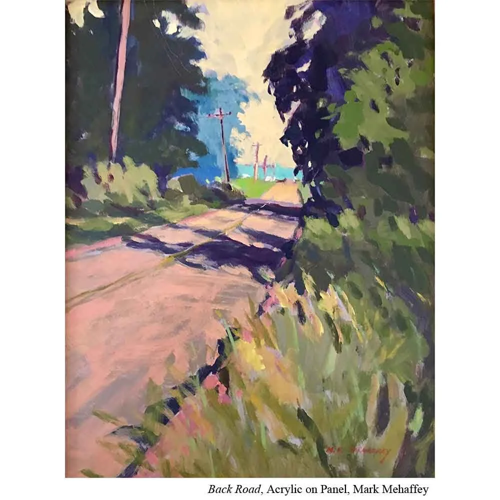
They’re where the details live. All those highlights, texture, and intricate brushwork makes a scene feel alive. But as artist Mark Mehaffey (Ep. 5) reminds us, big shapes play an equally crucial role in your painting’s success.
The good news? Understanding and using big shapes effectively isn’t complicated. It just takes awareness and intention.

Why Big Shapes Matter
Big shapes set the stage for everything else. They give your painting structure, rhythm, and visual clarity. Without them, a composition can easily turn into a jumble of competing details.
Big shapes work for you in three ways:
They create size contrast.
Your smaller, detailed shapes become more dynamic and noticeable when surrounded by large, simpler shapes. The contrast between big and small adds energy and interest.They establish scale.
A large building or mountain instantly gives the viewer a sense of how small the people, trees, or cars are in comparison. Big shapes anchor your painting in a recognizable sense of proportion.They provide rest for the eye.
Amidst a composition full of movement and detail, big shapes act as visual breathing spaces. They allow the viewer to pause, take in the scene, and move through the painting without overwhelm.
The Challenge with Big Shapes
Even when artists understand their importance, big shapes can still pose a challenge. They can feel flat or dull if handled without care. The temptation is to spice them up with too much contrast… but that can backfire.
According to Mehaffey, the key is contrast used wisely. We often think of contrast as a tool for grabbing attention. After all, high contrast areas naturally pull the eye toward focal points. But there’s another kind of contrast that’s equally valuable: low contrast.
Big shapes are where low contrast shines.
Subtle Contrast Keeps Shapes Unified
Low contrast lets you create variety within a big shape without breaking it apart. It keeps the shape’s integrity intact while still offering visual interest.
You can introduce this subtle variation through:
Value: Keep values close together so the shape holds as one.
Color temperature: Cool off distant areas; warm up foregrounds.
Saturation: Shift slightly between duller and richer versions of a hue.
Texture: Let brushwork add gentle variation without changing value or color dramatically.
A large green field, for example, doesn’t need to be one flat wash of green. You could cool the greens as they recede into the distance and warm them as they come forward, keeping the values similar but introducing a soft temperature shift.
Even the visibility of brushstrokes can provide a touch of contrast, adding movement and interest while maintaining the unity of the overall form.
Put It to Practice
Contrast simply means how different two things are. Black next to white? High contrast. A mid-tone gray next to a slightly lighter gray? Low contrast.
When working with big shapes, aim for low contrast to preserve unity. Here’s how to experiment with it:
Pick one large shape in your painting (like a sky, wall, or field).
Limit value shifts. Keep all tones within one or two steps of each other.
Add subtle variation using temperature (warm vs. cool) or hue (blue-green vs. yellow-green).
Avoid hard edges within the shape that might accidentally divide it.
Step back often. From a distance, you should still see one strong, cohesive shape.
By practicing subtlety, you’ll start to appreciate how quiet contrasts can be just as powerful as bold ones. Big shapes, handled thoughtfully, become the calm strength behind your composition, the thing that makes all the small shapes sing.