
How to Make Your Paintings Feel Cohesive with Julia Katz
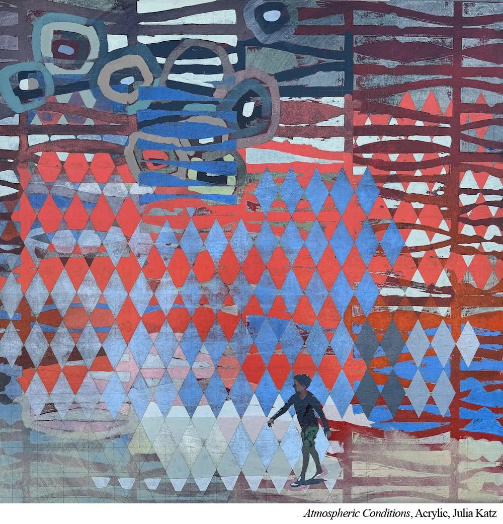
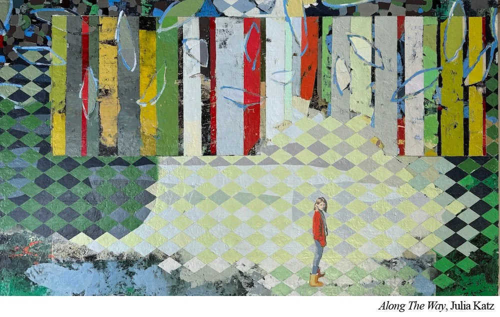
There’s a lot going on in a Julia Katz (Ep.110) painting—bold colors, complex patterns, and figurative elements that represent people and dogs. But with all that energy, there’s one guiding principle she never loses sight of: everything in the painting must belong.
This sense of belonging matters to Katz on two levels: metaphorically and technically. Here’s how to make them work.
The Metaphorical Level
Katz’s figures aren’t just subjects—they’re part of the world within the canvas. Whether her setting is a literal beach or a more abstract field of patterned color, she wants her subjects to feel in the space—not placed on top of it. The space is not just a backdrop. It’s a unified environment, and the figures must inhabit it.
The Technical Level
If the figures feel “pasted on,” it weakens the entire composition.
Why?
Because the eye is drawn to high contrast and recognizable forms. If one area—say, a detailed figure—stands out too sharply from its surroundings, it becomes a visual bullseye. That unbalanced contrast causes the viewer’s eye to fixate and stop, rather than move fluidly across the painting.
To integrate her figures with their environments, Katz relies on two main strategies: color harmony and contrast distribution.

1. Color Harmony
Katz limits her palette to about six colors plus white. These same colors are used throughout the entire painting—backgrounds, figures, patterns. This creates a built-in cohesion. When she needs a color, she mixes it from what’s already in use. A purple made from the same red and blue in the rest of the painting is naturally more harmonious than a random tube of purple squeezed in for convenience.
2. Contrast Distribution
Katz knows the eye gravitates toward contrast—especially when a realistic figure appears inside a sea of abstraction. To balance this, she doesn’t dull her figures; instead, she builds contrast into other areas of the painting too. Strategic pattern choices and shifts in value keep the visual energy moving and stop any one part from overpowering the rest.
Put it to Practice:
To help your paintings feel like a unified whole, try this two-step approach:
First, limit your palette. Stick with a small set of base colors (around 5–6) plus white. Mix everything from those. If you need purple, try making it from the red and blue already in your painting. This creates color relationships throughout the piece.
Second, pay attention to contrast. Step back from your work and observe. Where does your eye go? Is it getting stuck in one spot? If so, it might be due to an imbalance in contrast. Try adding high contrast to other areas to help move the viewer’s eye through the painting.
Cohesion isn’t accidental—it’s the result of mindful, intentional choices. Just like Katz, you can build that sense of belonging into every brushstroke.