
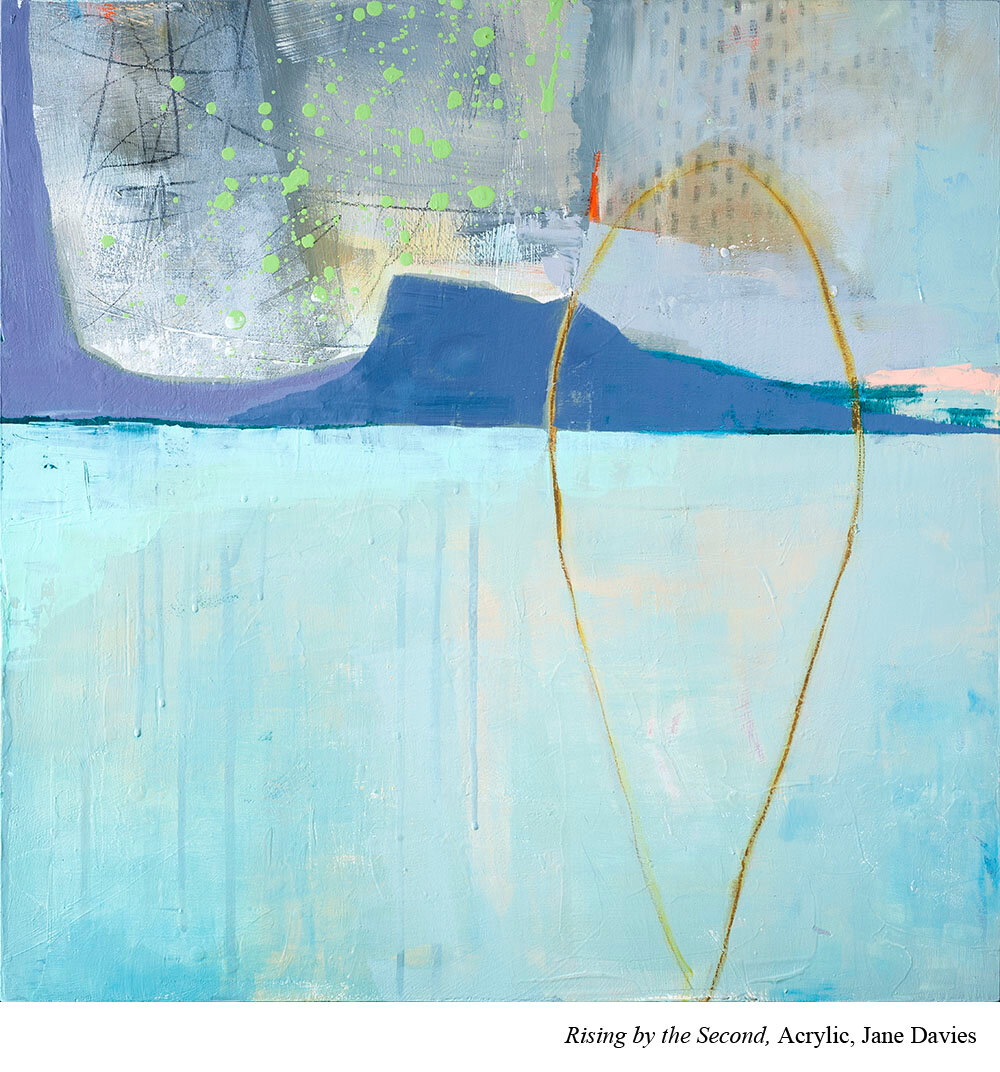
Episode 3: Jane Davies' Vocabulary
Hello there! Welcome back to the vocab page where we take some of the arty art terms from the week’s interview and talk about them in more depth. Take a listen to Jane Davies’ interview here.
Composition:
Here’s what Jane says about composition and I really like it. “It’s just the stuff that’s there on the page or the canvas.”
Basically, you can throw anything onto a canvas and it is composition. Now is it GOOD composition? Is it pleasing to the eye? Is it a composition that keeps your viewer’s eye on the page? Those are all sort of separate questions.
Composition vs design:
At some point I ask a question about design and Jane corrects me a little. (I genuinely love when artists do this.) Jane differentiates design and composition. For Jane, design is what you decide going into a piece. For example, engineers design a plane. They don’t just throw some metal in the air and see what flies. Artists design a painting when they do in with a plan like a value plan for example. Composition on the other hand is “just the stuff that’s there on the page or canvas.”
Value:
Value is how light or dark a color is. It is also sometimes called brightness. If you sucked out all the color (hue) you’d be left with a white, black or some level of grey. That is the value.
Contrast:
Jane talks about contrast in depth because contrast is one of her main tools. Contrast is a principle of design.
Contrast refers to how similar or different something is. If something has high contrast, there’s a lot of difference. If something has low contrast, there is very little difference.
For example, if a painting has high value contrast, then it may include a lot of white and a lot of black. White and black are on extreme sides of the value scale. A low contrast painting may be primarily made up of greys. There is not a lot of difference between the values used in the painting.
Just like value, you can think about contrast with anything in your painting. Let’s look at several kinds of contrasts:
Shape contrast-
Shapes come in all sizes: circles, squares, organic and inorganic, just to name a few. Some paintings have low shape contrast and everything is circular. Some have lots of shape contrast and there are circles, squares, triangles, stars, etc, etc.
Size contrast-
Something with lots of shape contrast would have big shapes and small shapes. Something with little shape contrast would have mostly small shapes or mostly big shapes but not a lot of both.
Chris Krupinski uses size contrast in her paintings. For example, she may use big pears with small grapes. Big shapes and small shapes.
You get the idea.
Formats:
In the interview we talk about one of Jane Davies’ classes on composition. We mention formats and especially the grid format. There are compositional formats that artists use. A bit like color schemes (see Episode 1 with Annie O’Brien Gonzales vocab list here to learn more), a compositional format is a road map for composition. They are an incredibly useful way to try your hand at composition before you feel really secure on the ideas. One of those formats is the grid format.
Grid Format (composition):
If you want to use a grid format, you decide that almost everything in your painting will take place up or down or side to side like if you were working on a grid. Here are a bunch of great examples of grid paintings.
Now you’re ready! Take a listen to Jane Davies’ interview here.